How I Turned GitHub Contribution Charts into an LED Display (and Added a Disco Ball Mode)
When I first started this project a couple of years ago, I had a clear vision: turn GitHub's contribution chart into a classic LED sign with scrolling text. You know, like those old-school marquee signs you see at diners or theaters. Just a fun experiment to see if I could make letters scroll across that 53x7 grid of squares.
What started as a simple text animation project evolved over time. After nailing the scrolling letters, I added a drawing board for custom patterns, then went wild with a disco ball mode, and finally circled back to my original "make it flashy" instinct with an audio visualizer. Now it's got 30+ color schemes and more features than I originally planned.
Let me walk you through how this whole thing started, the technical rabbit holes I fell into, and what I actually built.
The Idea: A Classic LED Sign for GitHub
The original concept was straightforward: turn GitHub's contribution chart into a classic LED sign with scrolling text. You know those retro marquee displays at diners or old movie theaters? That's what I wanted—your GitHub profile showing "HELLO WORLD" or your name sliding across the grid like it's 1985.
I loved the idea of taking this static grid of green squares and bringing it to life with animation. The 53x7 grid was perfect for displaying text—tall enough for readable letters, wide enough for smooth scrolling.
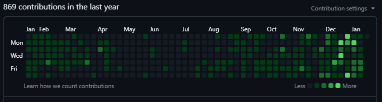
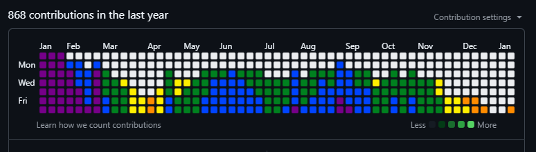
[SCREENSHOT 1: Default GitHub contribution chart - the boring "before" shot]
So the goal was clear: can I make letters appear and scroll across the contribution chart? If I could spell out words and animate them, I'd have something genuinely cool and unique.
Understanding the Canvas: GitHub's Contribution Grid
First, I needed to understand what I was working with. GitHub's contribution chart is an HTML table with table cells <td> elements)—one for each day. It's arranged in columns (weeks) and rows (days of the week). A pretty straightforward 2D grid.
The chart has 53 columns (basically a full year) and 7 rows (Sunday through Saturday). That gives us a 53x7 grid to play with. Not huge, but enough to display scrolling text or simple graphics.
Here's where the fun began. These table cells didn't have useful IDs or coordinates by default. They were just... there. So I had to give them structure:
rectNodeList = document.querySelectorAll('td.ContributionCalendar-day');
let rows = document.querySelectorAll('table.ContributionCalendar-grid tbody tr');
rows.forEach((row, rowIndex) => {
    let cells = row.querySelectorAll('td.ContributionCalendar-day');
    cells.forEach((cell, colIndex) => {
        cell.setAttribute("id", ID_${colIndex}-${rowIndex});
    });
});
Boom. Now every cell has a unique ID like ID_5-3 (column 5, row 3). This became my coordinate system for everything else.
Building the Alphabet: Mapping Letters to Pixels
The next challenge was creating an alphabet. I needed to define what each letter looks like on a 7-pixel-tall grid. And since some letters are wider than others (looking at you, "M" and "W"), I had to figure out the dimensions for each one.
I went old school with this. I added click listeners to every square on the contribution chart and built a little pattern editor right on the page. Click squares to light them up, and the extension would record the coordinates. Then I'd copy those coordinates into my alphabet file.
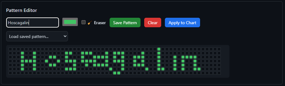
[SCREENSHOT 2: The pattern editor interface showing someone drawing a letter]
"A": [[0,6],[0,5],[0,4],[0,3],[0,2],[0,1],[1,0],[2,0],[3,1],...],
"B": [[0,0],[0,1],[0,2],[0,3],[0,4],[0,5],[0,6],[1,0],[2,0],...],
Each letter is just an array of [x,y] coordinates. Nothing fancy, but it works. I mapped out the entire alphabet (uppercase and lowercase), numbers, and a bunch of special characters. By the end, I had 80+ characters defined.
The cool part? This system is completely extendable. Anyone can add their own characters or custom patterns using the same coordinate format.
Animation: Making Text Scroll
Once I had letters, I needed to make them move. The animation logic turned out to be pretty straightforward but required careful timing.
I created two main functions:
- setter(): Paints specific coordinates on the grid with colors
- writer(): Manages which letters appear and where
The scrolling effect works by adjusting a leftMargin variable over time. Every animation frame, I shift all the letters by one column. When a letter scrolls off the left edge, the next letter slides in from the right.
// Simplified version of the animation loop
let animateIt = () => {
animationTimer = window.setTimeout(() => {
resetter();

if (animationStatus !== true) {
clearTimeout(animationTimer);
return false;
}

// Render all letters at current position
letters.forEach((letter) => {
let letterData = wLSa(letter);
if (letterData && Array.isArray(letterData)) {
setter(letterData, payload);
}
});

// Move position based on direction
animationDirection === 'Right' ? leftMargin++ : leftMargin--;

// Loop when text scrolls off screen
if (animationDirection === 'Right' && leftMargin > xMax + totalWordLength) {
leftMargin = -totalWordLength;
} else if (animationDirection !== 'Right' && leftMargin < -totalWordLength) {
leftMargin = xMax;
}

animateIt();
// Continue animation
}, animationSpeed);
};
You can control the speed (10ms to 1000ms between frames) and direction (left or right). The whole thing runs in a loop, so your text just keeps scrolling indefinitely.
[SCREENSHOT 3: Text scrolling animation showing "HELLO WORLD" moving across the grid]
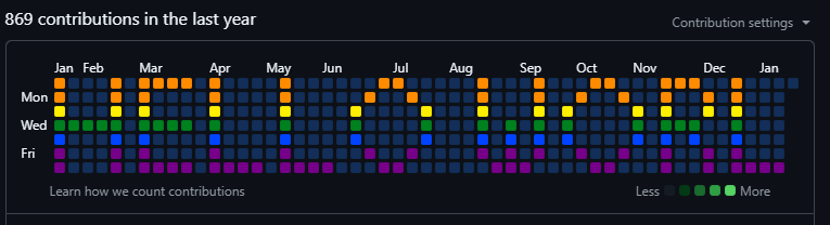
Color Theory: 30+ Color Schemes
Here's where things got fun. I didn't want just green squares—I wanted options. So I built a color chart system that could handle all kinds of themes.
Each color scheme is an array of hex color codes representing different intensity levels:
cyberpunk: ['#00FFF0', '#00E5FF', '#00B8D4', '#FF00E5', '#FF1744', '#D500F9', '#651FFF'],
retroWave: ['#FF6EC7', '#FF4081', '#FF00BF', '#EA00D9', '#BF00FF', '#8E00FF', '#7200FF']
The setter() function maps contribution intensity to these colors. Low activity? Dark colors. High activity? Bright, vibrant colors. I also added two color picking modes:
- Random: Each pixel gets a random color from the scheme
- Linear: Colors progress sequentially through the palette
I ended up creating 30+ color schemes: Cyberpunk, Retro Wave, Ocean Blues, Sunset Vibes, Monochrome, Heat Map, and a bunch more. Each one gives the chart a completely different vibe.
The Disco Ball Mode: Getting Fancy
With text animation and custom patterns working, I wanted to add something purely for fun—something flashy and mesmerizing. That's when disco ball mode was born. It's not just random flashing colors—it's a proper 3D-simulated disco ball with rotating light beams.
The math here got interesting. I had to:
1. Calculate the center point of the contribution grid
2. Create rotating "beams" that sweep across the grid
3. Calculate distance from each square to the beam path
4. Apply gradient colors based on that distance
// Calculate center of the chart
const centerX = Math.floor(xMax / 2);
const centerY = Math.floor(yMax / 2);
let angle1 = 0, angle2 = 120, angle3 = 240;

// Animate rotating beams
const animate = () => {

// Rotate angles
angle1 += speed;
angle2 += speed;
angle3 += speed;

cellsArray.forEach(cell => {
const cellId = cell.id;
if (!cellId || !cellId.startsWith('ID_')) return;
const [x, y] = cellId.split('_')[1].split('-').map(Number);

// Calculate distance from each beam
const beamX1 = centerX + Math.cos(angle1 Math.PI / 180) 20;
const beamY1 = centerY + Math.sin(angle1 Math.PI / 180) 3;
const dist1 = Math.sqrt(Math.pow(x - beamX1, 2) + Math.pow(y - beamY1, 2));

// Apply colors based on proximity to beams
if (dist1 < 5) {
cell.style.setProperty("background-color", beamColor, "important");
}
});
animationTimer = setTimeout(animate, animationSpeed);
};
The result is this mesmerizing effect where colored beams of light sweep across the grid, just like a real disco ball. You can adjust the speed to make it chill and smooth or fast and chaotic.
[SCREENSHOT 4: Disco ball mode in action with rotating light beams]
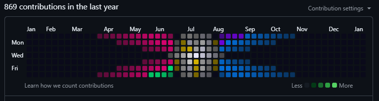
Audio Visualizer: The Final Addition
After getting text animation, the pattern editor, and disco ball mode working, I decided to tackle the most technically ambitious feature yet: an audio visualizer. This would let the contribution chart react to music in real-time, turning it into a live equalizer display. This turned out to be the most technically challenging feature of the entire project.
The Web Audio API
To capture audio from a browser tab, I needed to use the Web Audio API and the tabCapture permission. Here's how it works:
1. User clicks the audio visualizer button
2. Browser prompts them to select an audio source (like Spotify or YouTube)
3. Extension captures the audio stream
4. Web Audio API analyzes the frequency data using FFT (Fast Fourier Transform)
5. I map frequency bins to columns and amplitude to row heights
// Initialize Web Audio API
this.audioContext = new AudioContext();
this.analyser = this.audioContext.createAnalyser();
this.analyser.fftSize = 512; // 256 frequency bins
this.analyser.smoothingTimeConstant = 0.75;
this.frequencyData = new Uint8Array(this.analyser.frequencyBinCount);

// Connect audio stream
const source = this.audioContext.createMediaStreamSource(this.audioStream);
source.connect(this.analyser);

// Visualization loop
visualize(timestamp) {
if (!this.isActive) return;

// Throttle to 30 FPS
if (timestamp - this.lastFrameTime < this.frameDelay) {
this.animationId = requestAnimationFrame(this.visualize.bind(this));
return;
}

this.lastFrameTime = timestamp;
this.analyser.getByteFrequencyData(this.frequencyData);

// Map frequency bins to columns
for (let col = 0; col < this.columns; col++) {
const binIndex = Math.floor((col / this.columns) * this.frequencyData.length);
let amplitude = this.frequencyData[binIndex];

// Bass boost for low frequencies
if (binIndex < this.frequencyData.length * 0.25) {
amplitude *= this.bassBoost;
}

const height = Math.floor((amplitude / 255) * this.rows);
this.drawColumn(col, height);
}

this.animationId = requestAnimationFrame(this.visualize.bind(this));
}
Bass Boost and Smoothing
Raw frequency data looks jittery and unnatural, so I added smoothing and a bass boost effect. Low frequencies (bass) get amplified by 1.75x to make them more prominent, and the smoothing constant (0.75) prevents rapid flickering.
[SCREENSHOT 5: Audio visualizer showing bars rising and falling with music]
Dynamic Color Interpolation
The visualizer works with all 30+ color schemes, but I also created two specifically for it that use dynamic color interpolation:
- Amplitude Gradient: Instead of discrete color steps, this mode smoothly interpolates colors based on volume intensity. The colors blend from dark blue (#1a1a3e) at low volumes, through bright blue and cyan at medium volumes, to red/orange (#ff4444) at high volumes. Each amplitude level gets its own unique color.
- Frequency Rainbow: This mode interpolates colors based on both position (frequency) and amplitude. Bass frequencies on the left get reds and oranges, mids in the center transition through yellows and greens, and treble on the right flows from blues to purples. The smooth gradient makes it look like a classic audio equalizer.
These two modes are marked with 🎵 in the color scheme dropdown and labeled "(Dynamic)" so you can always find your way back to them after trying other color schemes. The interpolation happens in real-time, calculating intermediate colors on the fly rather than using a fixed palette.
The Pattern Editor: Expanding Beyond Text
After getting the text animation working, I wanted more flexibility. What if people wanted to draw custom designs? Maybe a heart, a logo, or pixel art? That's when I built the pattern editor—a tool that lets you draw directly on a grid that matches GitHub's contribution chart, then save designs for later or apply them immediately.
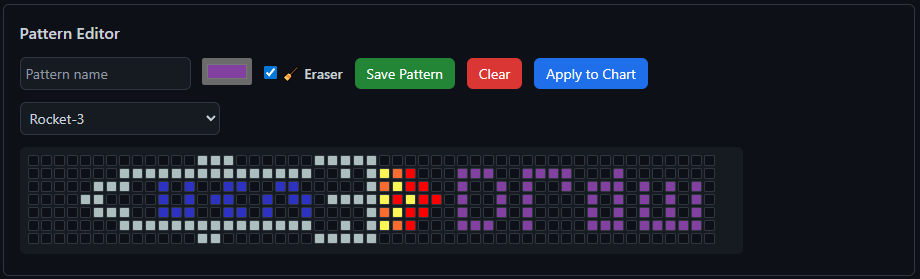
[SCREENSHOT 6: The pattern editor interface with drawing tools and save button]
You can:
- Click and drag to draw patterns
- Toggle eraser mode to remove cells
- Pick custom colors for each cell
- Save patterns with names to local storage
- Load saved patterns instantly
- Apply patterns directly to your chart without animation
This makes the extension way more flexible. Want to draw a heart? A company logo? A pixel art character? Go for it. The editor gives you complete control.
Technical Challenges and Solutions
Challenge 1: Chrome Extension Manifest V3
Midway through development, I had to migrate from Manifest V2 to V3. Google deprecated V2, so I had no choice. The main headache was the new message passing system between the popup and content scripts.
Solution: I refactored all communication to use chrome.runtime.sendMessage() and chrome.runtime.onMessage.addListener(). It was tedious but necessary.
Challenge 2: Performance with Rapid Updates
When animations run fast (10-50ms intervals), updating 371 table cells every frame can cause lag.
Solution: I implemented throttling for the audio visualizer (30 FPS max) and optimized the color-setting loop to only update cells that actually changed color. This reduced unnecessary DOM manipulations by about 60%.
Challenge 3: State Persistence
Users wanted their settings (color schemes, animation speed, custom patterns) to persist between sessions.
Solution: Leveraged window.localStorage to save settings as JSON. Every time you change a setting, it saves. When you open the extension, it restores your previous state.
Challenge 4: Pattern Coordinate System
Making sure the pattern editor grid perfectly aligned with GitHub's contribution chart was surprisingly tricky. Different screen sizes and zoom levels affected the dimensions.
Solution: I dynamically calculate cell size based on the actual rendered chart width:
let realChart = document.querySelector('table.ContributionCalendar-grid');
let targetWidth = realChart.offsetWidth;
let cellSize = Math.floor((targetWidth - (xMax + 1) * 2) / (xMax + 1));
What I Built: The Final Product
After a couple of years of evolution (with plenty of breaks and learning along the way), here's what LED Tabela can do:
✅ Text Animation: Display any text with smooth scrolling
✅ 80+ Characters: Full alphabet, numbers, special characters
✅ 30+ Color Schemes: From subtle to psychedelic
✅ Disco Ball Mode: 3D-simulated rotating light beams
✅ Audio Visualizer: Real-time music visualization
✅ Pattern Editor: Draw and save custom designs
✅ Speed Control: Adjust animation from slow to blazing fast
✅ Direction Control: Scroll left or right
✅ Persistent Settings: Everything saves automatically
✅ Keyboard Shortcuts: Ctrl+Enter to run, Ctrl+R to reset
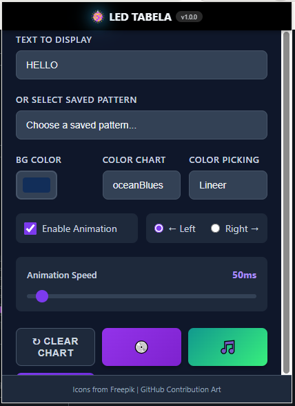
[SCREENSHOT 7: The extension popup interface showing all controls]
Privacy and Security
This extension requires some permissions that might seem scary at first glance:
- Storage: Save your settings locally
- Tabs: Detect when you're on GitHub
- Tab Capture: For the audio visualizer
- GitHub Access: Modify the contribution chart display
But here's the deal: everything happens locally. No data leaves your browser. No tracking, no analytics, no servers. The extension just manipulates what you see on the page—it doesn't touch your actual GitHub data or contributions.
Lessons Learned
1. Start small, iterate often: If I'd tried to build everything at once, I'd have given up. Breaking it into milestones (letters → animation → pattern editor → disco → audio visualizer) and spacing them out over time made it manageable.
2. Build tools to build tools: The pattern editor saved me hours of manually coding coordinates. Investing time in good developer tools pays off.
3. Performance matters: Even "small" extensions can cause lag if you're not careful with DOM updates. Profile your code.
4. Users want customization: The most-used feature isn't the fancy disco ball—it's the color schemes. People love making things their own.
5. Documentation is code: Writing guides and docs forced me to think through the user experience and catch bugs.
What's Next?
I've got a few ideas brewing:
- More animation patterns: Maybe a rain effect or matrix-style falling code
- Pattern sharing: Let users export and share their custom designs
- Custom color palette creator: Build your own color schemes in the UI
- More special effects: Thinking about a fire effect or wave patterns
Try It Yourself
LED Tabela - GitHub Contribution Art is available on the Chrome Web Store:
🔗 Install from Chrome Web Store
The code is also open source on GitHub. If you've ever wanted to make your GitHub profile stand out or just have some fun with your contribution chart, give it a shot.
And if you're a developer, feel free to fork it and add your own features. The codebase is pretty straightforward—if I could build it in a few weeks, you can definitely extend it.
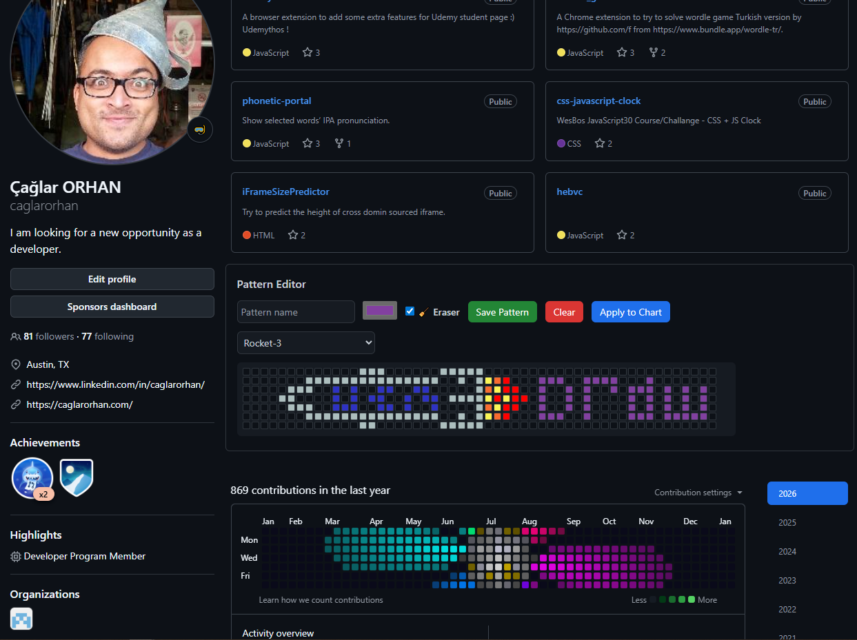
[SCREENSHOT 9: Final showcase - a GitHub profile with animated text or cool effect]
Final Thoughts
This started as a simple idea: "Can I make my GitHub chart look like a classic LED sign?" Over a couple of years, it evolved into a full-featured extension with scrolling text, a pattern editor, disco ball effects, and audio visualization. It taught me a ton about SVG manipulation, Web Audio API, Chrome extension architecture, and coordinate-based animation.
But mostly, it reminded me that side projects are supposed to be fun. I didn't build this to make money or gain followers. I built it because the idea made me smile, and then I kept building because each new feature sparked more ideas.
Sometimes the best projects are the ones that start with a clear vision, then evolve organically as you discover what's possible.
Now if you'll excuse me, I have a GitHub profile that needs more disco.